Loading...
Ross Conover
Designer × Developer
WHO AM I?
I design websites, then I make them work. I have jumped back and forth from designer and developer roles, with a degree in Communication Design and over four years of experience in corporate web development. I am always looking for new ways to merge my two passions together.
When I'm not making websites, you'll find me building video games, discovering new music, catching up on my film watchlist, or finding something new to collect.
Everything on this site is fully designed and developed by me. No code libraries, no boilerplates, and no templates.
WEB PROJECTS
- Branding
- e-Commerce
- Website
- Illustration
- Personal
- Visit Website
- Github Repo
KRILL MEAT
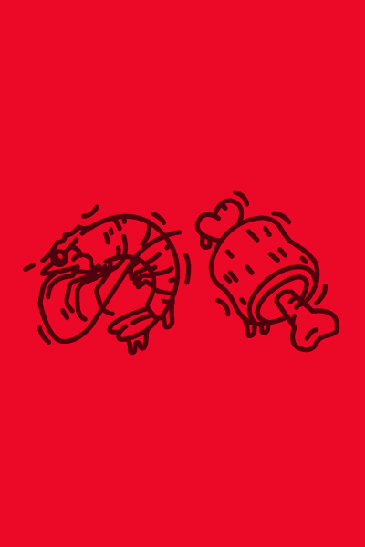
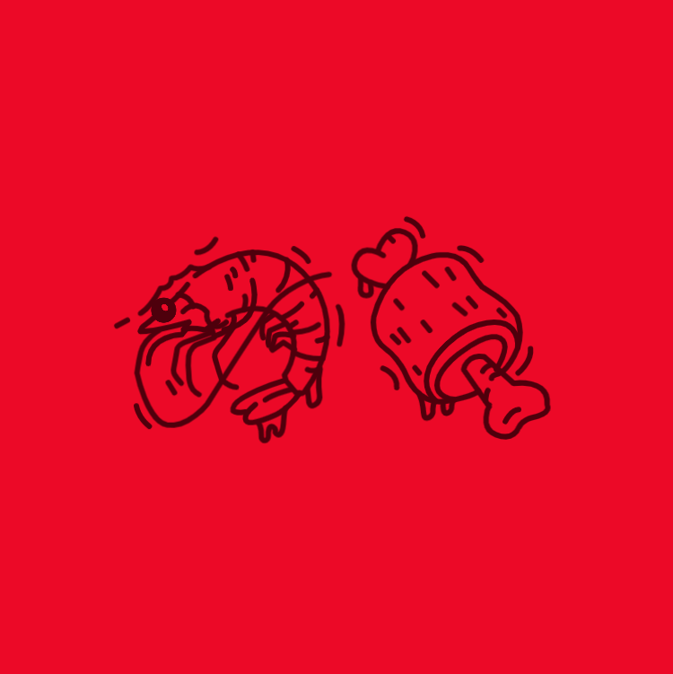
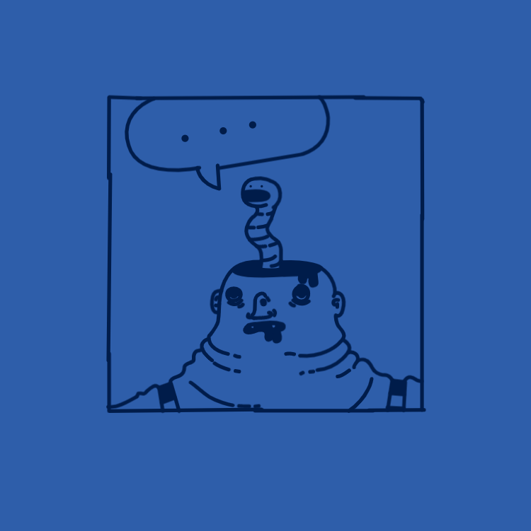
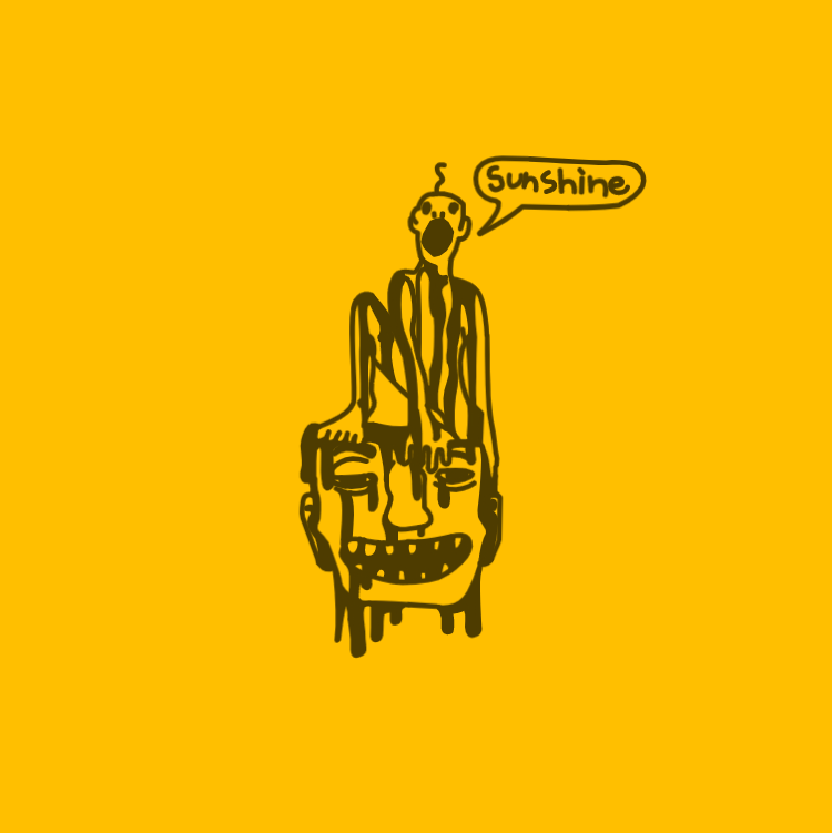
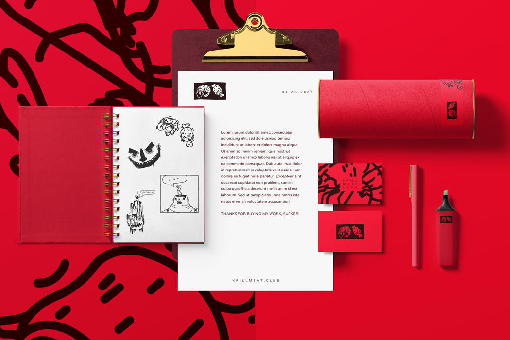
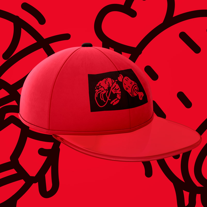
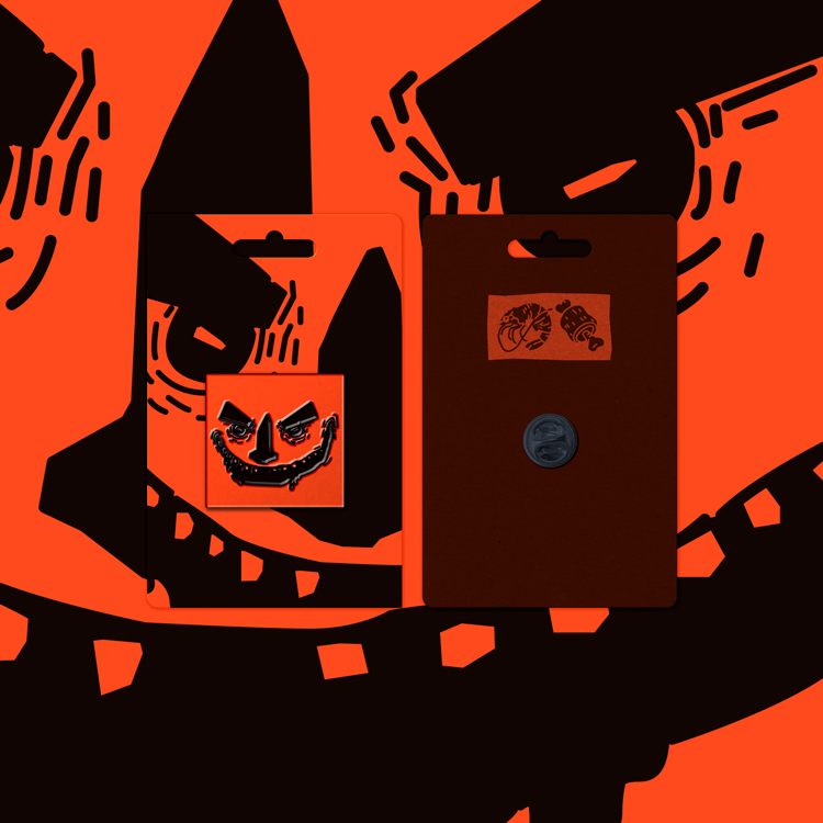
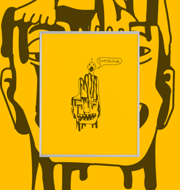
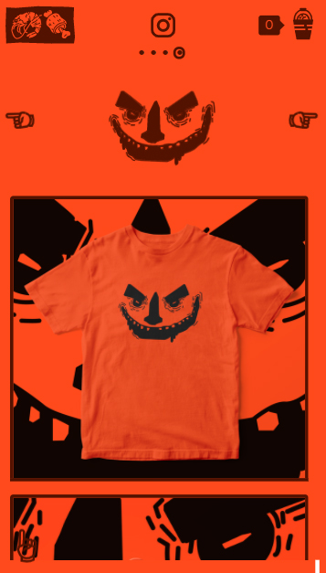
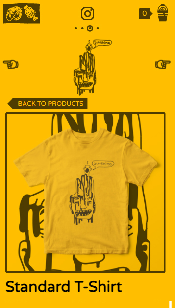
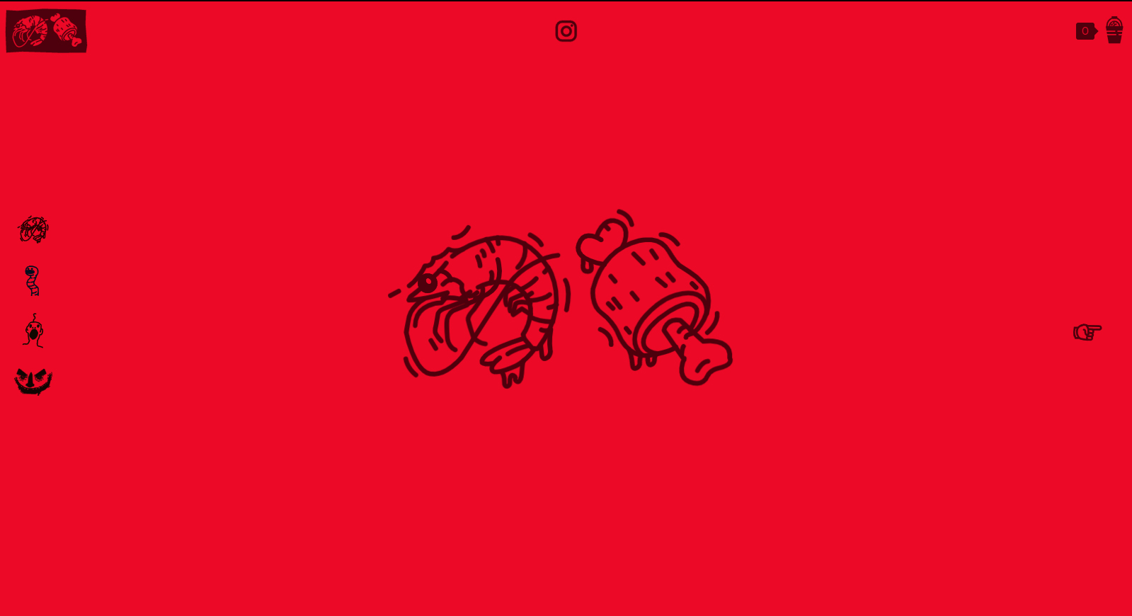
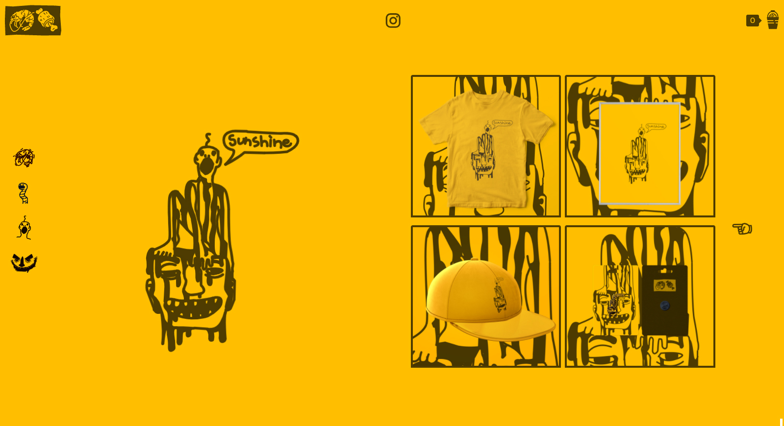
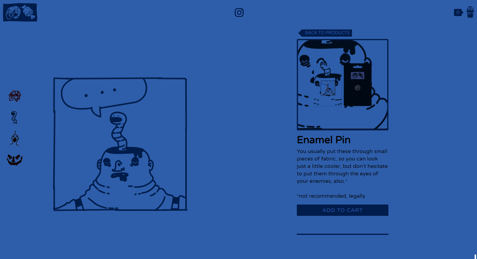
View the WebsiteKrill Meat is a personal brand I have been building over the past few years. I have been doodling in the margins for years, gathering sketchbooks, notepads, and lots of post its. When coworkers started asking for the illustrations I had on my desk, I decided to move forward with the idea of promoting, branding, and selling my work.
Krill Meat embodies funny, simple, sometimes jarring, often uncomfortable, consistently messy illustrations. I wanted to make sure the website worked not only as an online store, but also a portfolio to showcase my work, so the art is front-and-center.
Illustration

Application + Products

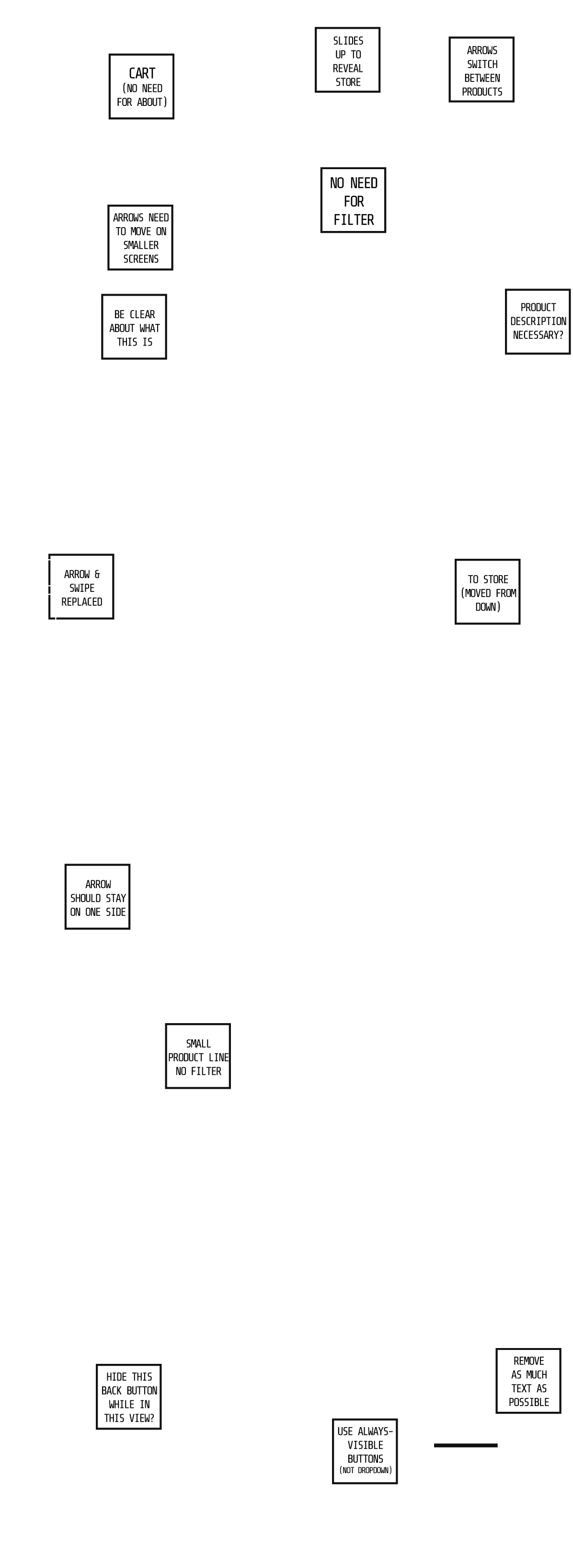
Wireframes
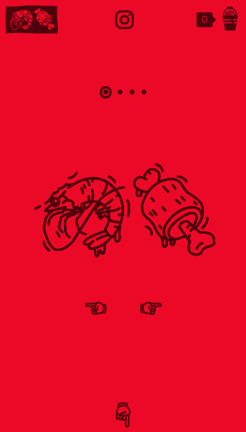
Website Screens
Code
For this site, I wanted to use some kind of subtle animation technique to create a sense of unease with the illustrations. To do that, I needed to keep all of the SVG files seperated and inline, so I could manipulate various pieces. To do this without cluttering up the HTML, I pulled all of the svg data into a JS object as Strings, and used JS to inject them into the page. From there, it's simple CSS Animations to create the effects.
Beyond the SVG management, I also wanted to include a simple swiping carousel on mobile. I built a custom JS plugin that integrated with the overall page manager to control the effect on mobile.
See it Work on the Site/**
* TOUCH START HANDLE
* ----------------------------------------------------------------------
* Handles the effects of the Touch Start Event
* ----------------------------------------------------------------------
* @param {Event} e Event object
* ----------------------------------------------------------------------
*/
touchStartHandle(e){
debug?.debugLog("EVENT [touchstart] :: Start point = "+e.touches[0].clientX+" , "+e.touches[0].clientY);
this.moveDelta = [0,0];
this.startCoordinates = [e.touches[0].clientX,e.touches[0].clientY];
}
/**
* TOUCH MOVE HANDLE
* ----------------------------------------------------------------------
* Handles the effects of the Touch Move Event
* ----------------------------------------------------------------------
* @param {Event} e Event object
* ----------------------------------------------------------------------
*/
touchMoveHandle(e){
this.moveHappened = true; // While true, a moving has happened (prevents a Click from counting as a Move on second interaction)
// Get the current coordinates and set the Deltas based on difference to Start Points
this.currCoordinates = [e.touches[0].clientX , e.touches[0].clientY];
this.moveDelta = this.calculateDelta(this.startCoordinates, this.currCoordinates);
// If the Delta is past a certain point, animate the Slide Elem slightly for visual feedback
// TODO - Allow for more varieties of effect, not just subtle slide
if(Math.abs(this.moveDelta[0]) >= 20) this.slide(this.moveDelta);
}
/**
* TOUCH END HANDLE
* ----------------------------------------------------------------------
* Handles the effects of the Touch End Event
* ----------------------------------------------------------------------
* @param {Event} e Event object
* ----------------------------------------------------------------------
*/
touchEndHandle(e){
debug?.debugLog("EVENT [touchend] :: Delta = "+this.moveDelta);
// If the Delta is past a certain number, check which direction from the start the end coordinates are, then send the direction to the Callback Function
if(this.moveHappened){// This check has to be here to prevent a "click" as counting as a move
if(Math.abs(this.moveDelta[0]) >= 50 ){ // The move window, how long it takes before it counts as a "swipe" | TODO - Set this value through Param
if(this.moveDelta[0] > 0){
this.effectCallback({direction: 'left'});
} else{
this.effectCallback({direction: 'right'});
}
} else{ // If you don't meet the delta requirement to trigger the event, just send no direction to the callback
this.effectCallback({direction: 'none'});
}
this.moveHappened = false;// Reset the Move Happened check to prevent "Click swiping"
}
}
/**
* CALCULATE DELTA
* ----------------------------------------------------------------------
* Takes Start and End Coordinates and returns the differences between them
* ----------------------------------------------------------------------
* @param {Array} start The X and Y position at the start of the Touch Event
* @param {Array} end The X and Y position at the end of the Touch Event\
* @returns An Array of the Deltas between the Start and End points
* ----------------------------------------------------------------------
*/
calculateDelta(start, end){
return [end[0] - start[0], end[1] - start[1]];
}
/**
* SLIDE
* ----------------------------------------------------------------------
* Allows the Slide Element to Slightly Move when dragging
* TODO - Allow Y movement as well
* ----------------------------------------------------------------------
* @param {Array} delta Array of Deltas between the Start and End points
* ----------------------------------------------------------------------
*/
slide(delta){
if(Math.abs(delta[0]) <=50 )this.slideElem.style.transform = `translateX(${Math.ceil(delta[0]/2)}px)`;
}

- Branding
- Event
- Website
- Collateral
- Visit Website
- Github Repo
ABSORB
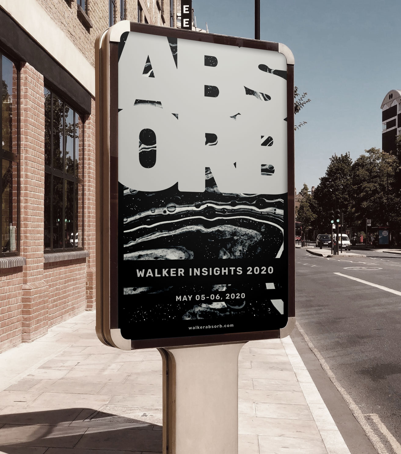
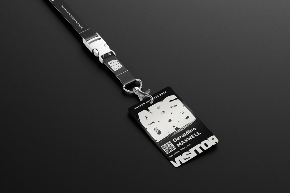
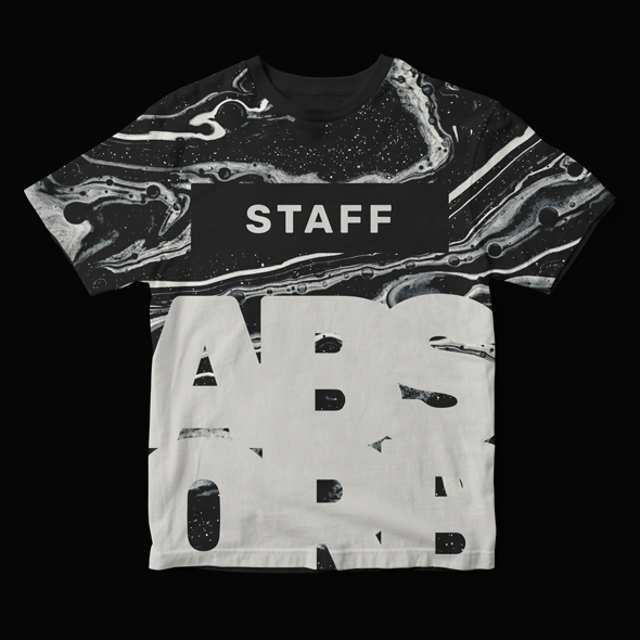
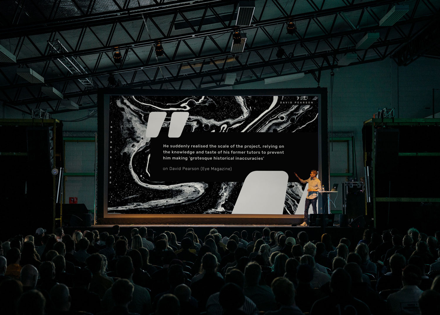
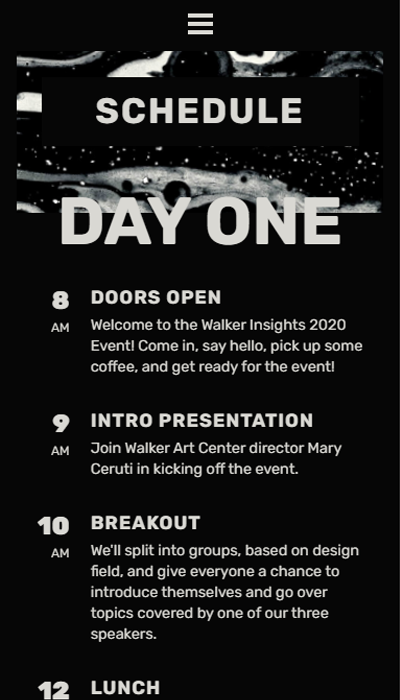
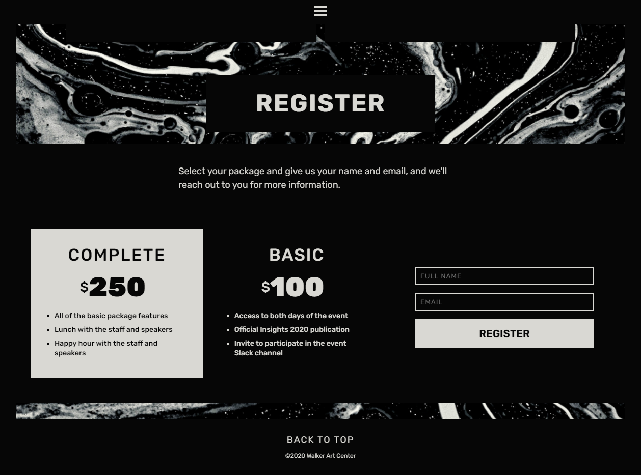
View the WebsiteThe Walker Insights series is an annual conference, held in Minneapolis which covers a variety of themes in design. Each year, a selection of designers are chosen to speak about their work and process, and answer questions from the audience.
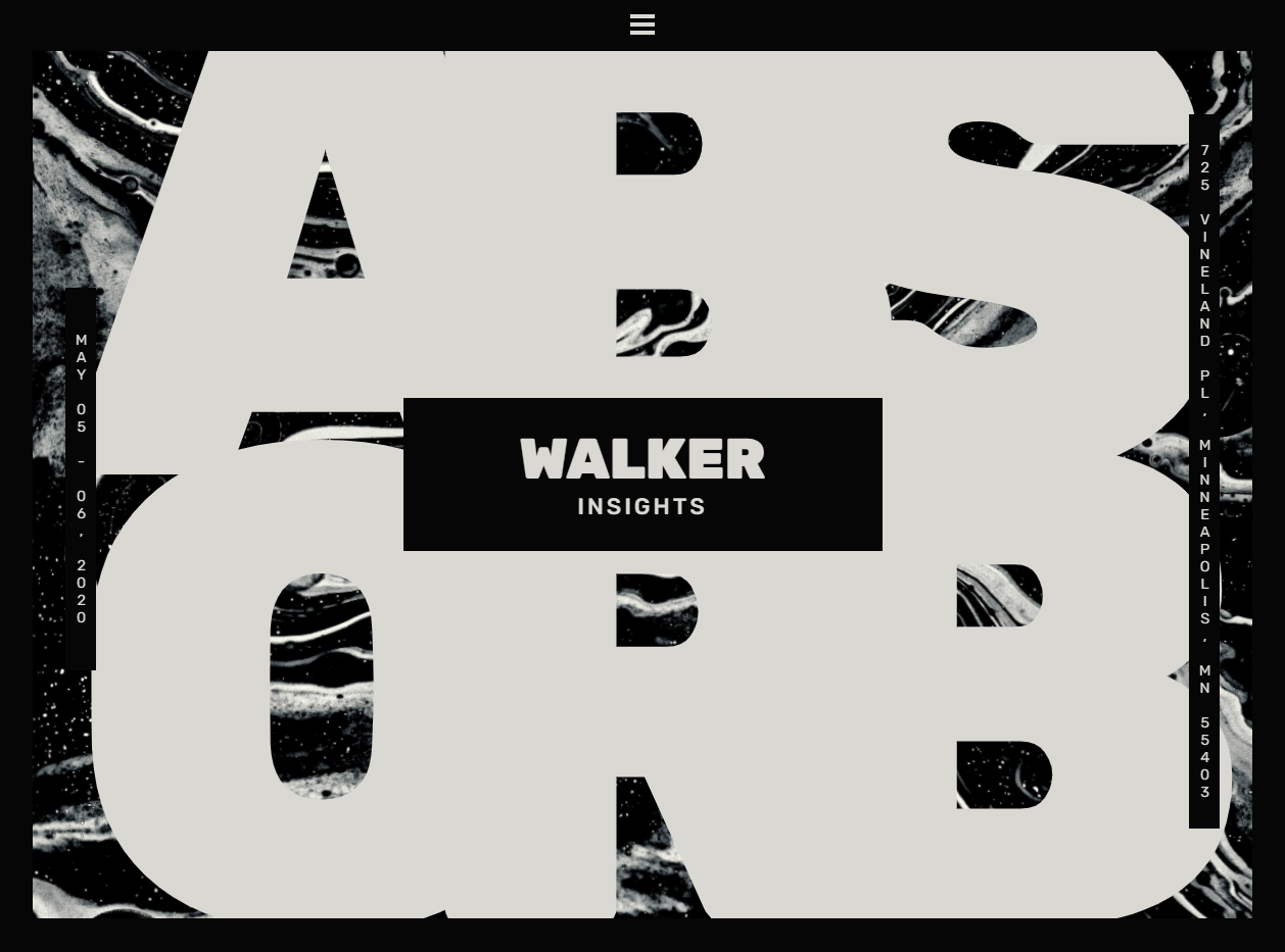
ABSORB is a hypothetical conference, created by gathering three existing lectures from earlier years and tieing them into one cohesive concept.
The concept of ABSORB came from points of discussion in each of the three lectures. From there, I created a cohesive brand for that theme, and used that brand to create advertising, collateral, and presentation resources.
Color
The choice to use black and white reflects the nature of the event: a lecture series that features three unique artists. Given these artists will be showcasing their own work, the surrounding design should allow their work to take the center stage, without any clashing themes or colors.
Dark#060606
Light#D9D8D3
Typography
Rubik
Subheadings and Body Copy
I chose Rubik because it works well at any scale and fits ABSORB’s visual theme. The typeface is soft and playful at thick weights, however its blocky shape and rounded edges keep it legible at smaller font sizes and looking clean, but not sterile.
Application


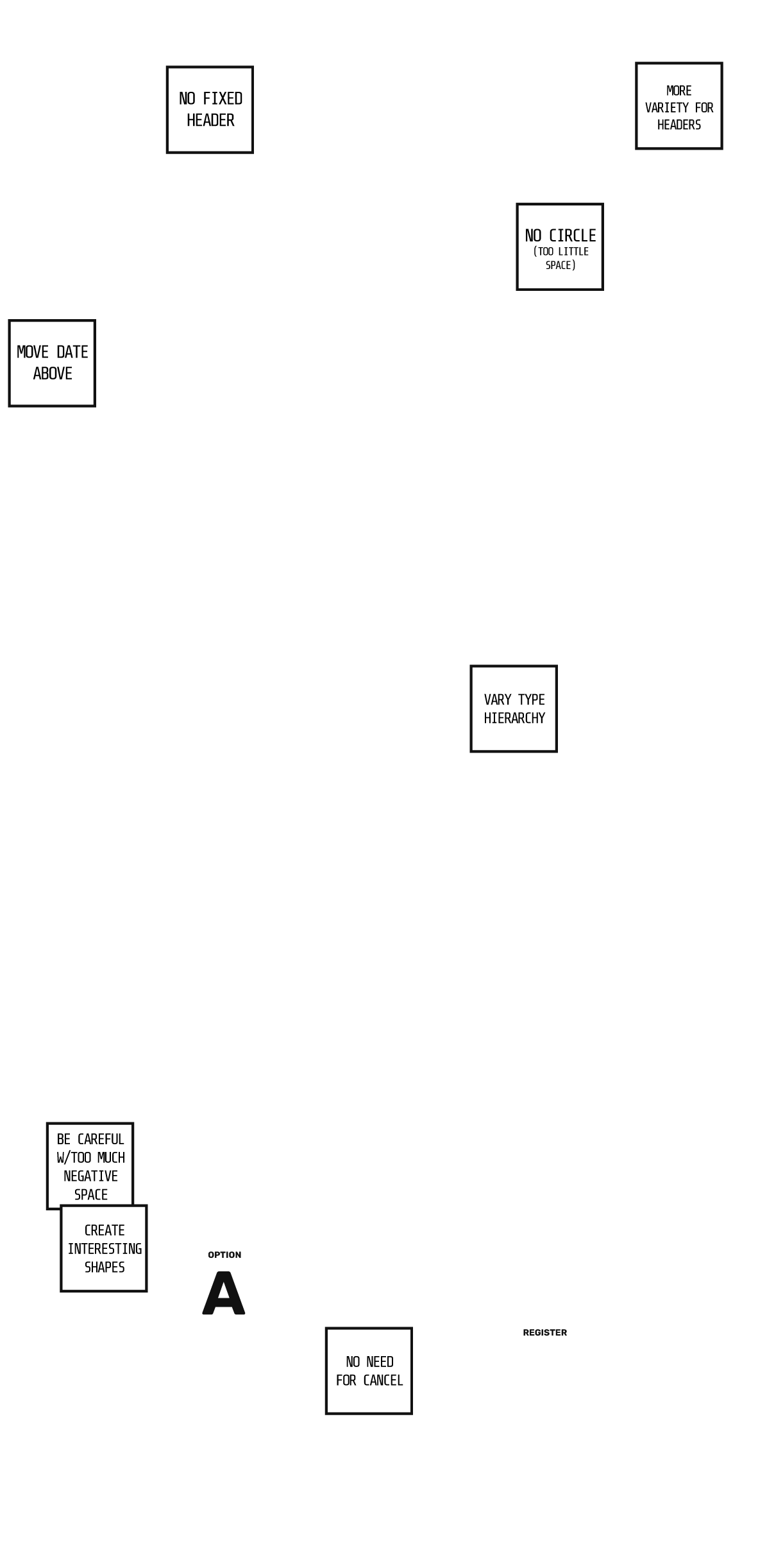
Wireframes
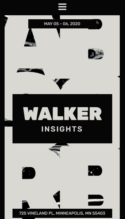
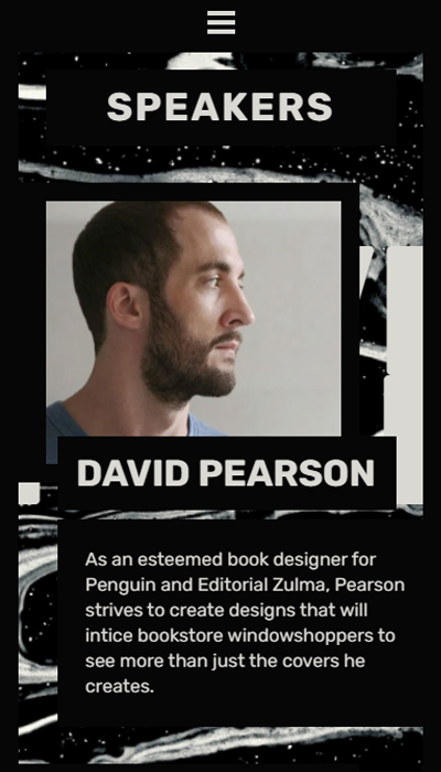
Website Screens
Code
This website does not use any customized JavaScript code snippets, however there is a small amount of CSS used to animate the background:
See it Work on the Site@keyframes backgroundWarp{
0%{
background-position: 50% 50%;
transform: scale(1) rotate(0deg)
}
50%{
background-position: 20% 50%;
transform: scale(1.5) rotate(8deg)
}
100%{
background-position: 50% 50%;
transform: scale(1) rotate(0deg)
}
}
- Exhibition
- Collateral
- Poster Design
- Website
- Visit Website
- Github Repo
IMPACT
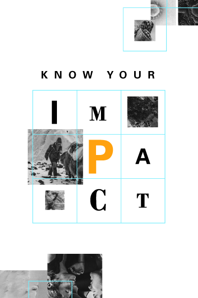
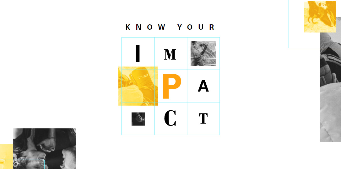
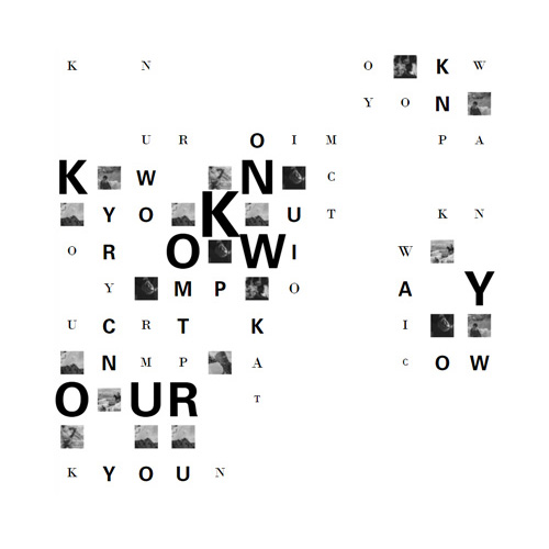
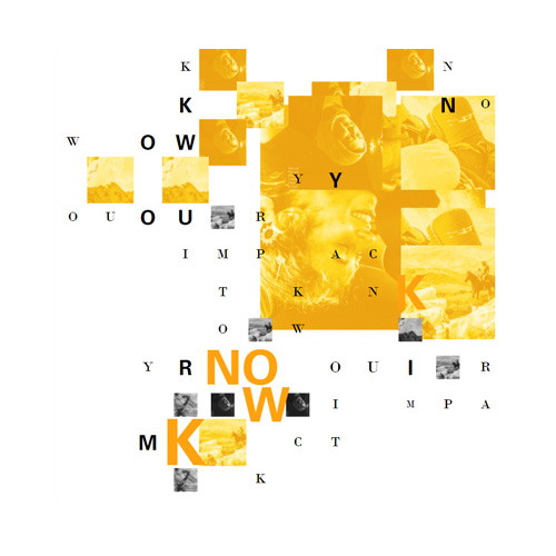
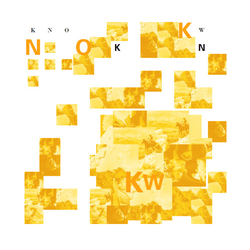
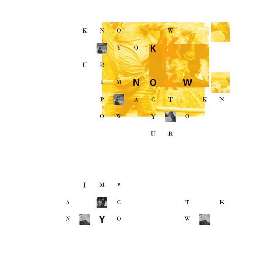
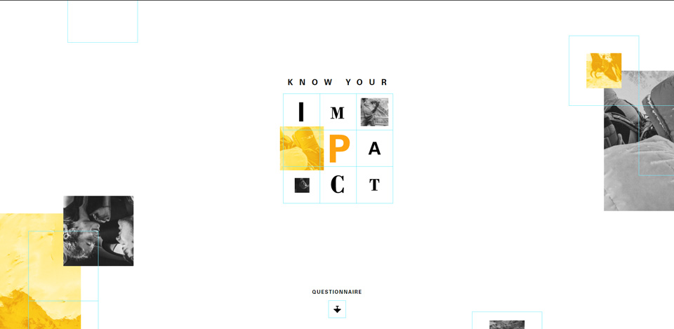
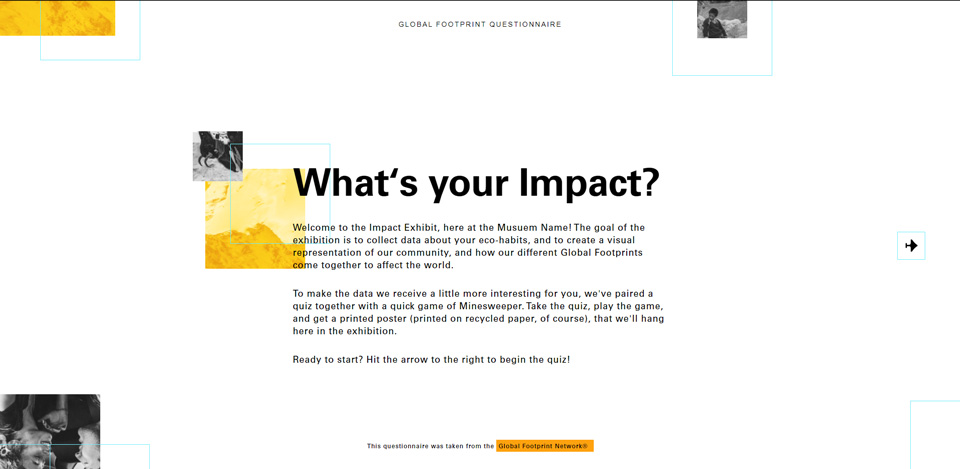
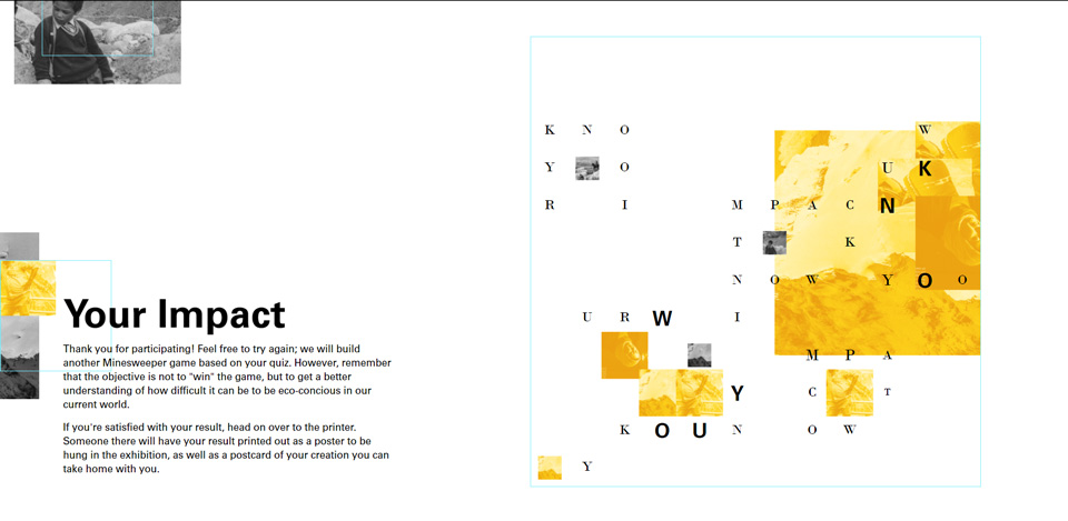
Impact is a science and art exhibition designed to teach participants about their carbon footprint and its impact on their community, while they play games and make art.
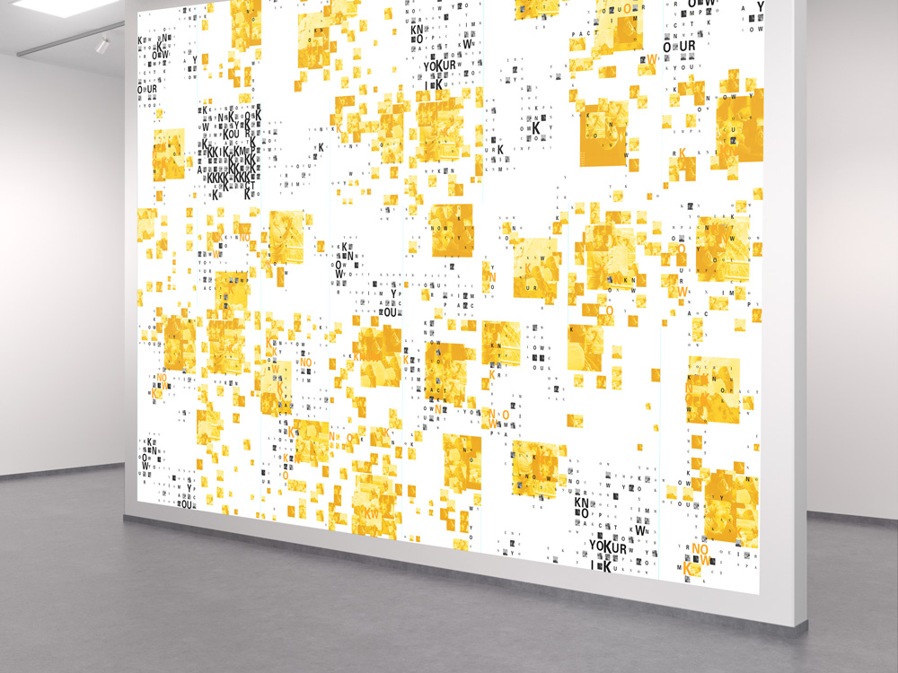
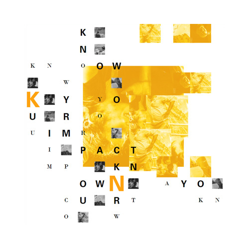
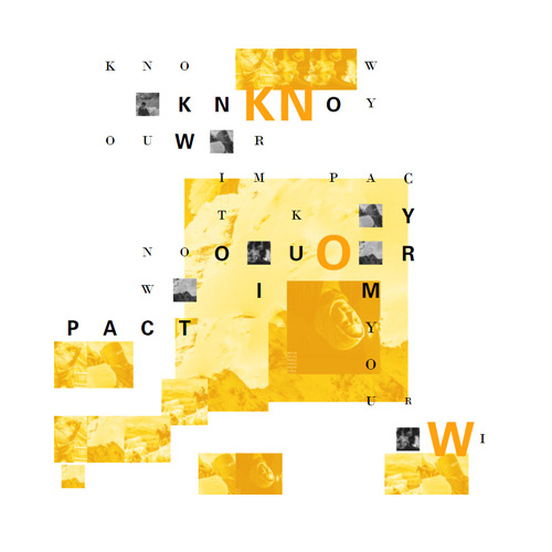
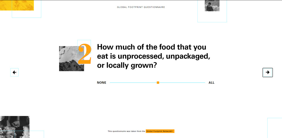
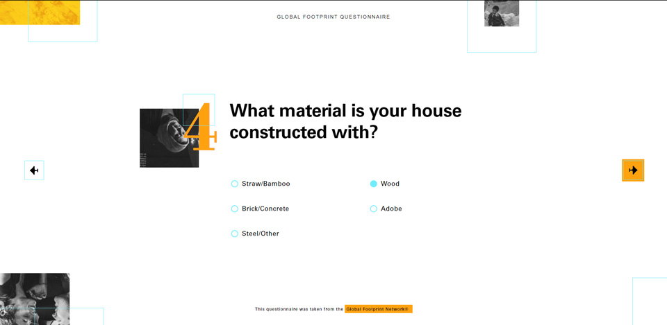
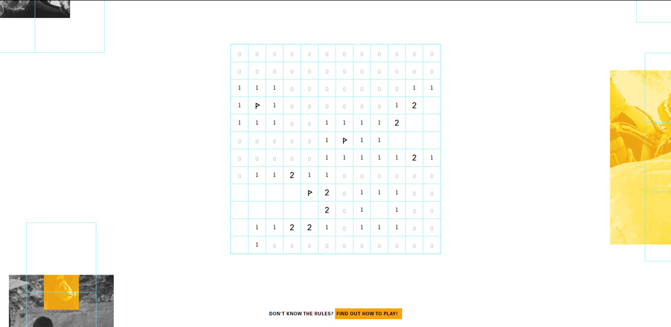
Visitors complete a quiz about their personal habits that generates a game of Minesweeper. Once they play the game, their results produce a poster that is hung together with others on a gallery wall. By the time the exhibition comes to an end, these posters will fill the wall and create one large mural: a collage of environmental impact.
Logo
Color
I chose a two-toned color scheme because the posters will be printed with a Risograph printer. Additionally, this contrast emphasizes my concept of “Man vs. Nature.” To ensure that I had ample contrast, I chose a light blue for the grid, commonly found in other grid functionality in computer design programs.
White Paper#FFFFFF
Black Ink#000000
Orange Ink#FFA20F
Blue Grid#72ECFC
Typography
Continuing with the concept of dichotomy, I chose two fonts that are in stark contrast to one another: Bodoni is more delicate, and Univers is more impactful.
Exhibition
Web/Kiosk Screens
This "web" project was conceived as a kiosk for the exhibition, and not for external public viewing. As such, it is only designed for the full screen size of the computers that are connected to the Risograph printer
Code
For the website, I built Minesweeper from scratch and used the results of the game to generate HTML elements to make a poster. It's too much to showcase all of the essential code here, so I broke down a couple of key points:
checkTile(x,y){
let tile = this.matrix[x][y];
if(this.gameOn && (tile.status == "blank" || tile.status == "flagged") ){
tile.setStatus("clicked");
if(tile.type == "bomb"){
tile.setStatus("bomb-detonated");
this.blowUp();
}else{
this.checkNumber(x,y);
this.clickedTiles++;
}
if(this.clickedTiles >= this.totalTiles - this.bombCount){
console.log("YOU DID IT!");
this.callback(this.elem,"win");
this.gameOn = false;
}
}
}
- Branding
- e-Commerce
- Packaging
- 3D-Modeling
- UI/UX
- Website
- Visit Website
- Github Repo
SERVELLO
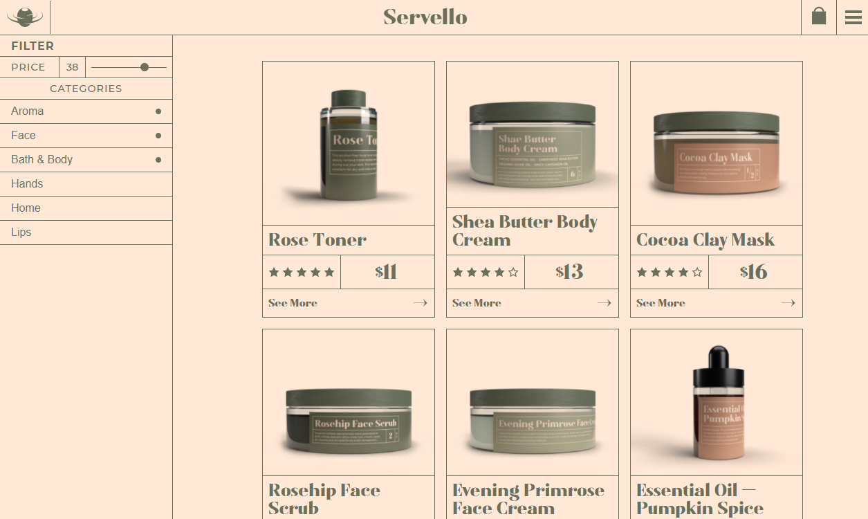
Visit WebsiteServello is a skin care brand that focuses on natural, organic products. The company’s inception came from the memories of home remedies in an old, Italian kitchen. To echo the emotion of memory, while keeping things feeling natural, the direction the brand took was delicate and pristine, without losing the warmth of nostalgia.
Servello may be a small company, selling organic and natural products, but the owner’s background in biology sets it on a higher level than the others in its field. Servello focuses on keeping you looking and feeling good, without the lasting damages that may come with other skin care products, all while staying smart and natural.
Logo

Color
The colors were all chosen to reflect the atmoshpere that Servello cultivates with their promise to create all-natural products.
Olive#6B705C
Artichoke#A5A58D
Champagne#FFE8D6
Pine#DDBEA9
Pasta#CB997E
Typography
Matao
Montserrat
Matao's high-contrast stroke weights and mix of casual and high-class feel mesh well with the brand of Servello: refined, yet accessible. Montserrat was chosen to be a neutral font to pair easily with the statement font, and works well to help reinforce a clean and professional attitude.

Packaging
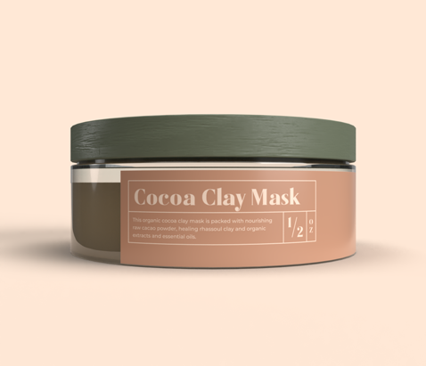
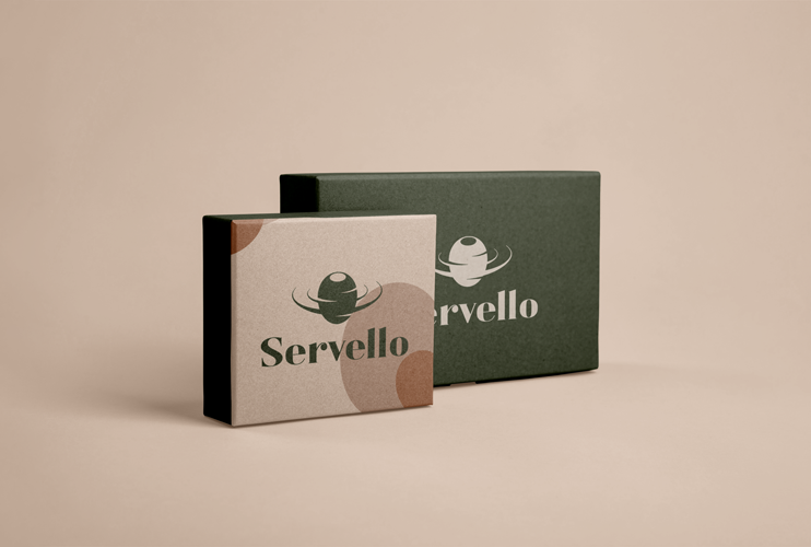
A big part of the brand for Servello is tradition meets modernity. I wanted to pull inspiration from classic labels, especially for apothecary bottles, and trim down the detail to allow for a more modern look and feel.



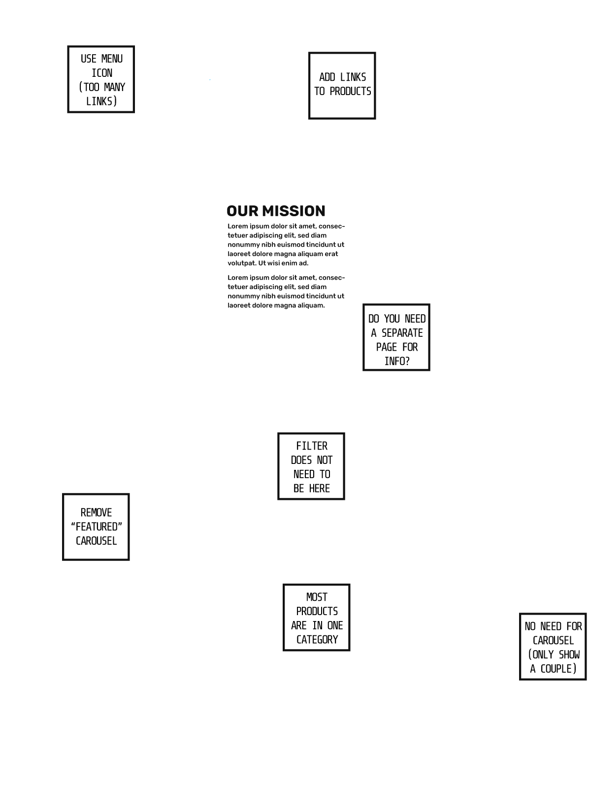
Wireframes
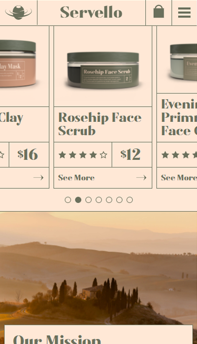
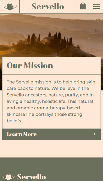
Website Screenshots


Code
I wanted to create a small interactive effect for the background "pattern" on the larger hero sections. This code makes the patterns move around in relation to the mouse on the hero section.
See it Work on the Websitefunction handleCoolMouse(e){
let t = document.getElementById("hero");
// Grab the center of the element, and its relationship to the mouse position
let hCenter = t.offsetWidth / 2;
let vCenter = t.offsetHeight / 2;
let deltaX = (e.clientX - t.offsetLeft) - hCenter;
let deltaY = (e.clientY - t.offsetTop) - vCenter;
// I don't want the offset to ever go past a certain point (200px)
if(deltaX > 200){ deltaX = 200 }
else if(deltaX < -200){ deltaX = -200 }
if(deltaY > 200){ deltaY = 200 }
else if(deltaY < -200){ deltaY = -200 }
// Go through each piece of the pattern and offset them
for(let i = 0; i < heroBlobs.length; i++){
let translate = `translate(${-1*(deltaX/4)*heroBlobs[i].dataset.offset}px,${-1*(deltaY/4)*heroBlobs[i].dataset.offset}px)`;
heroBlobs[i].style.transform = translate;
}
}

- Branding
- Restaurant
- Illustration
- Website
- Visit Website
ATTAGIRL
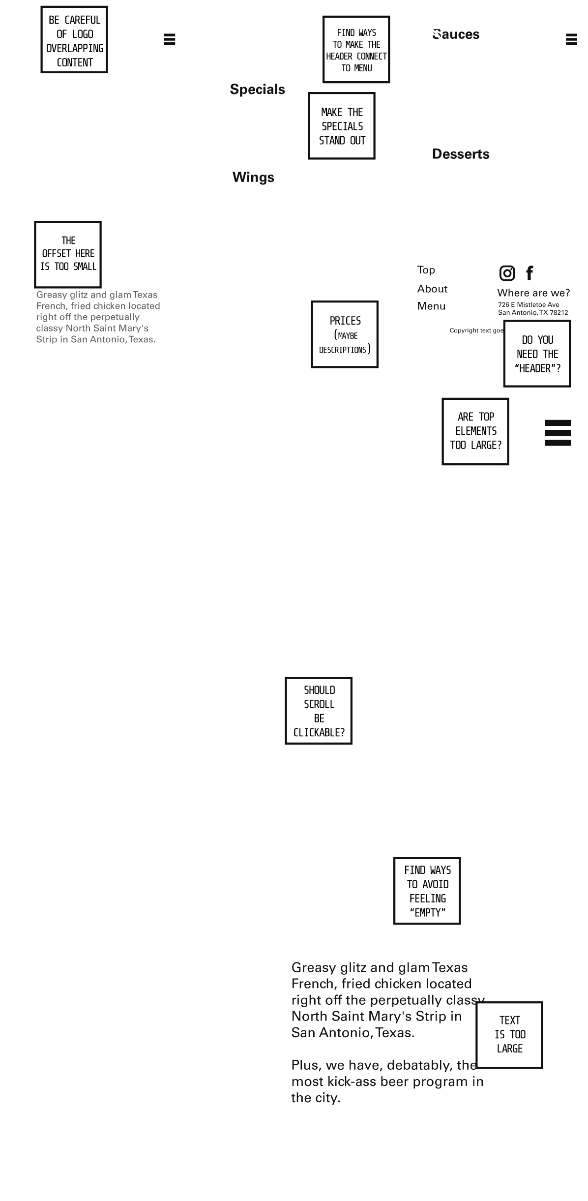
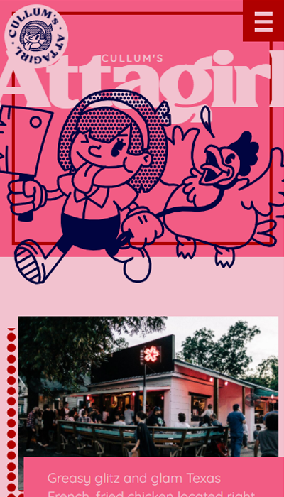
View the WebsiteCullum's Attagirl is a fried chicken and beer restaurant located on the St. Mary’s Strip in San Antonio. The area is known for its bars, restaurants, and murals, and has cultivated a trendy but down-to-earth environment.
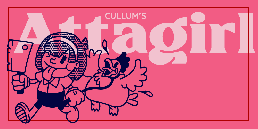
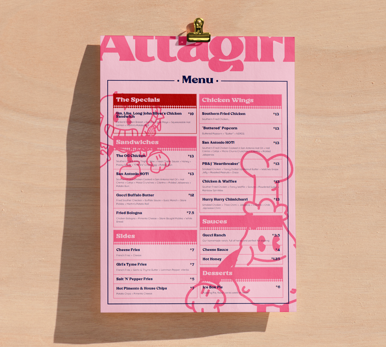
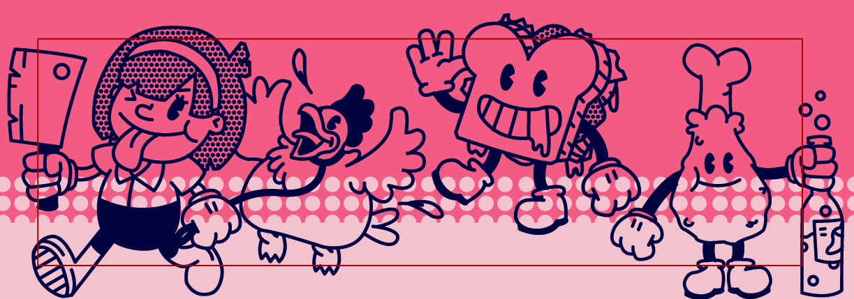
The Attagirl restaurant and its atmosphere have a sarcastic attitude, most notably featured in their menu and language, however their branding does not reflect it. I updated the Attagirl brand to match their overall tone, and freshen up their look to keep pace with competitors in a quickly-growing "fancy fast food" industry.
Logo

Color
The colors need to be simple and playful, and "mostly" duotone. The range of the reds, pulled from Cullum’s original branding, provide depth, but the stark contrast between them and the dark blue give the design a more of a "colorized black and white" feeling.
Pale Pink#F2C2CF
Pink Pink#F25C84
Ketchup#AF0000
Just Blue#010440
Typography
Rigeko
Quicksand
Application



Illustration
Wireframes
Website Screenshots


Code
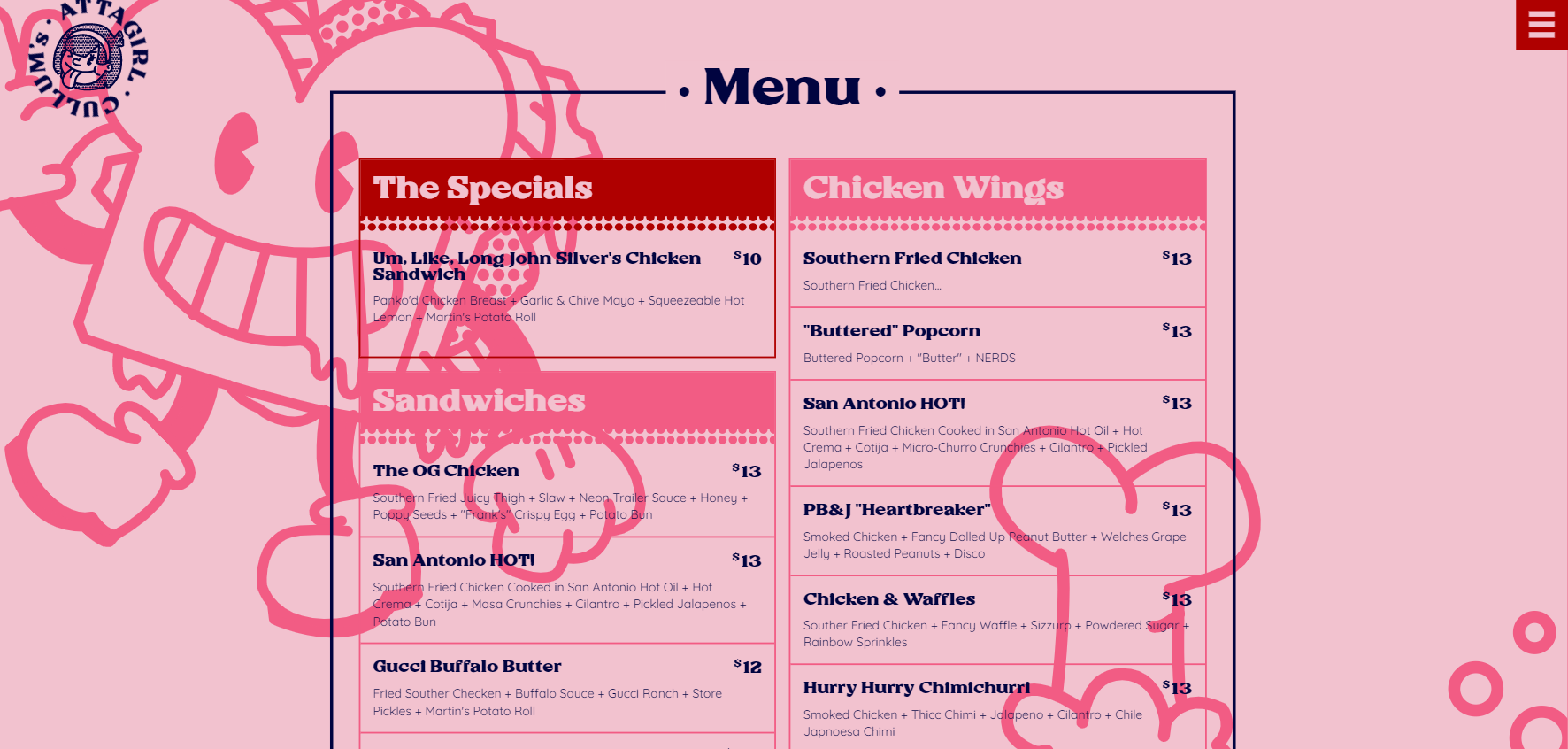
The menu section of this page might seem innocuous, but it actually has a heavy amount of code in place to create the masonry effect:
See it Work on the Siteclass GRID_MASONRY{
constructor(elem){
this.elem = elem;
this.subsectionElems = this.elem.querySelectorAll(".sub-section")
this.subsectionArray = this.buildSubsectionArray();
if(debug) debug.log("Initializing Grid Masonry...");
if(window.innerWidth >= 900){
this.calculateHeights(this.subsectionArray);
this.calculateTops(this.subsectionArray);
}
// window.addEventListener("resize", this.resizeHandle.bind(this));
}
buildSubsectionArray(){
let obj = this;
let array = [];
for(let i = 0; i < obj.subsectionElems.length; i++){
array.push(obj.subsectionElems[i]);
}
return array;
}
calculateHeights(array){
for(let sub of array){
let subHeight = sub.querySelector("div").offsetHeight;
let rowCount = Math.ceil(subHeight / 24) + 1;
console.log("Sub Height = "+subHeight+" / 16 = "+rowCount);
sub.style.gridRowEnd = "span "+rowCount;
}
}
calculateTops(array){
let obj = this;
let leftArray = obj.elem.querySelectorAll(".left");
let leftCurrTotal = 1;
for(let sub of leftArray){
sub.style.gridRowStart = leftCurrTotal;
leftCurrTotal += Math.ceil(sub.querySelector("div").offsetHeight / 24 ) + 1;
}
let rightArray = obj.elem.querySelectorAll(".right");
let rightCurrTotal = 1;
for(let sub of rightArray){
sub.style.gridRowStart = rightCurrTotal;
rightCurrTotal += Math.ceil(sub.querySelector("div").offsetHeight / 24 ) + 1;
}
}
resizeHandle(e){
if(window.innerHeight >= 900){
} else{
}
this.calculateHeights(this.subsectionArray);
this.calculateTops(this.subsectionArray);
}
}
- Branding
- Website
- Logo
- Visit Website
- Github Repo
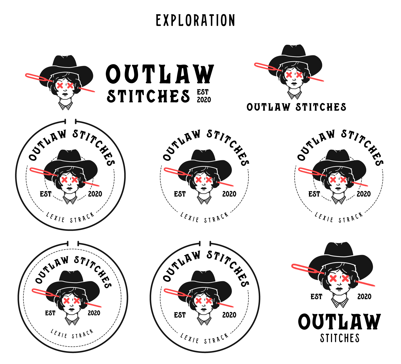
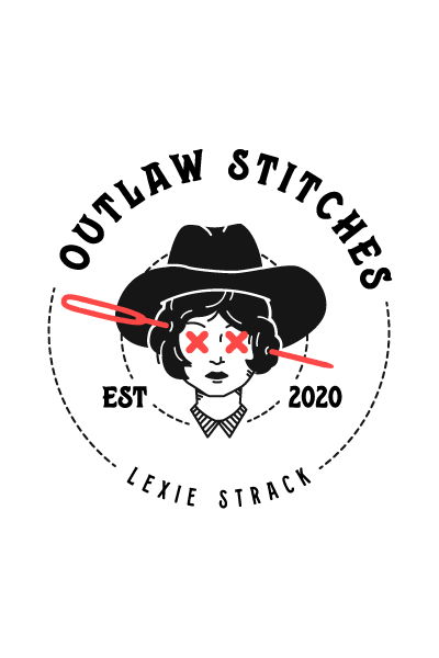
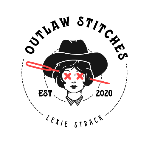
OUTLAW STITCHES
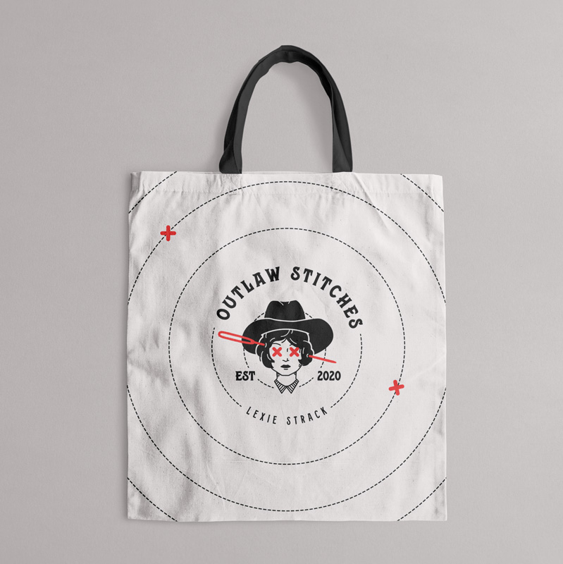
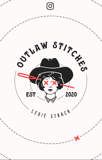
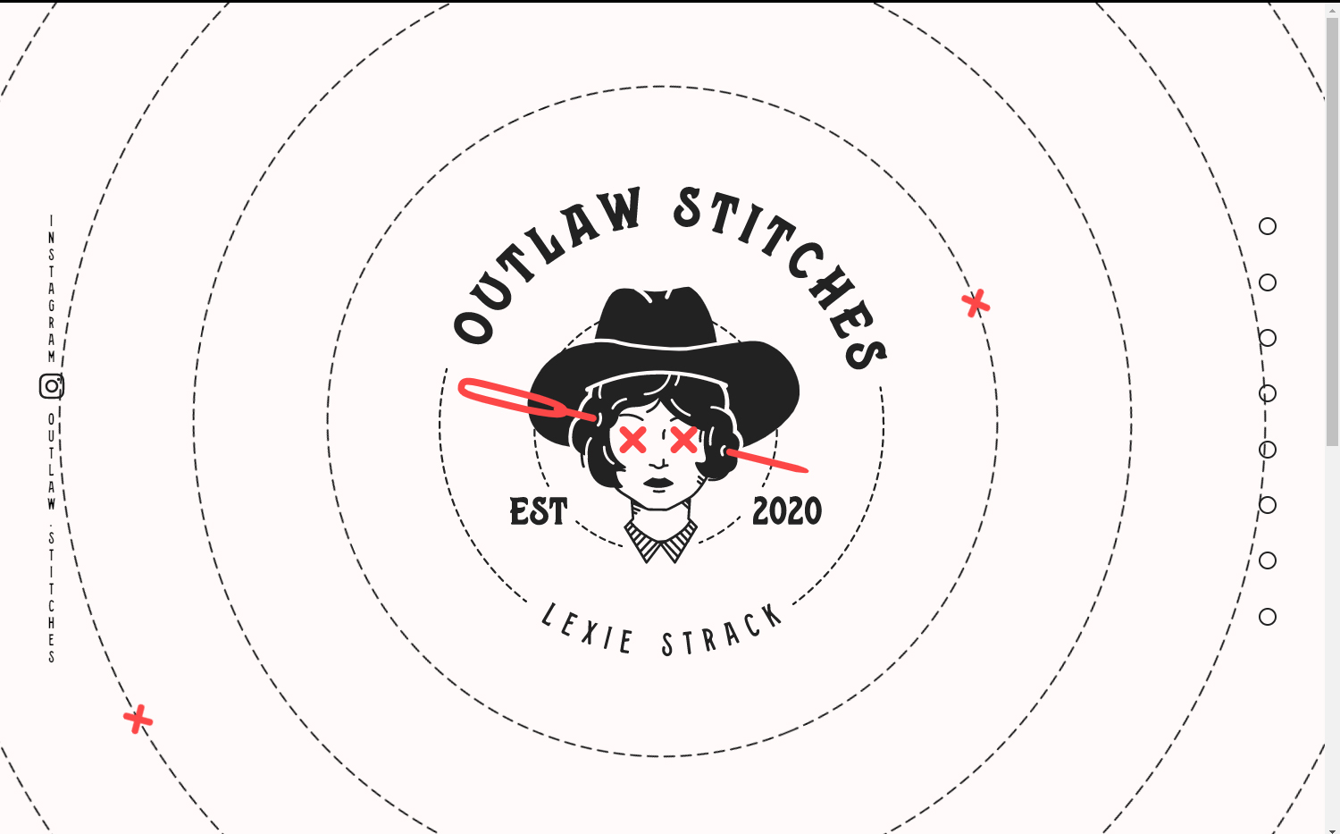
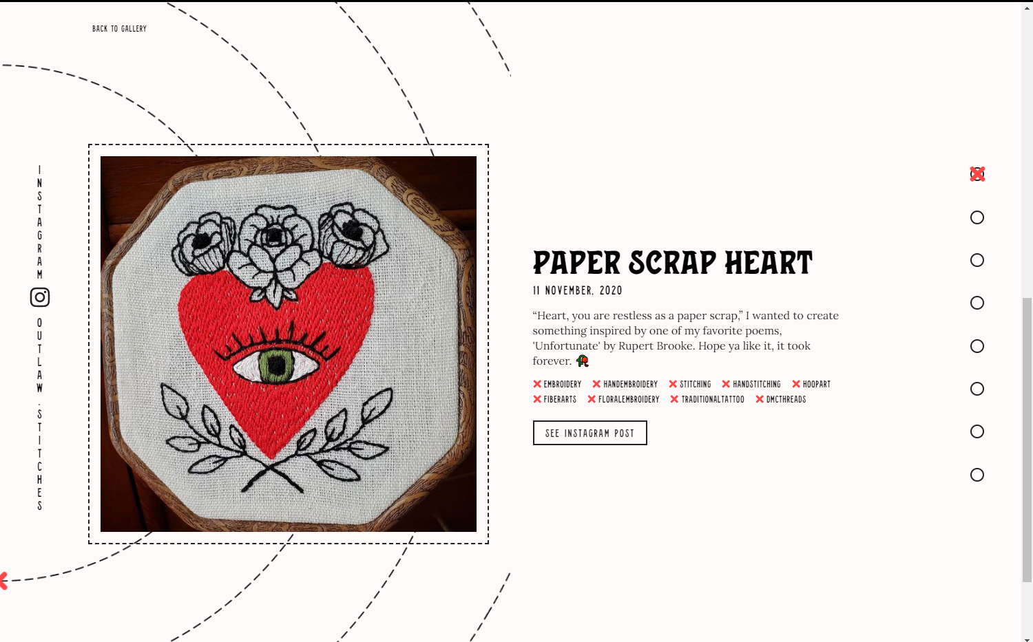
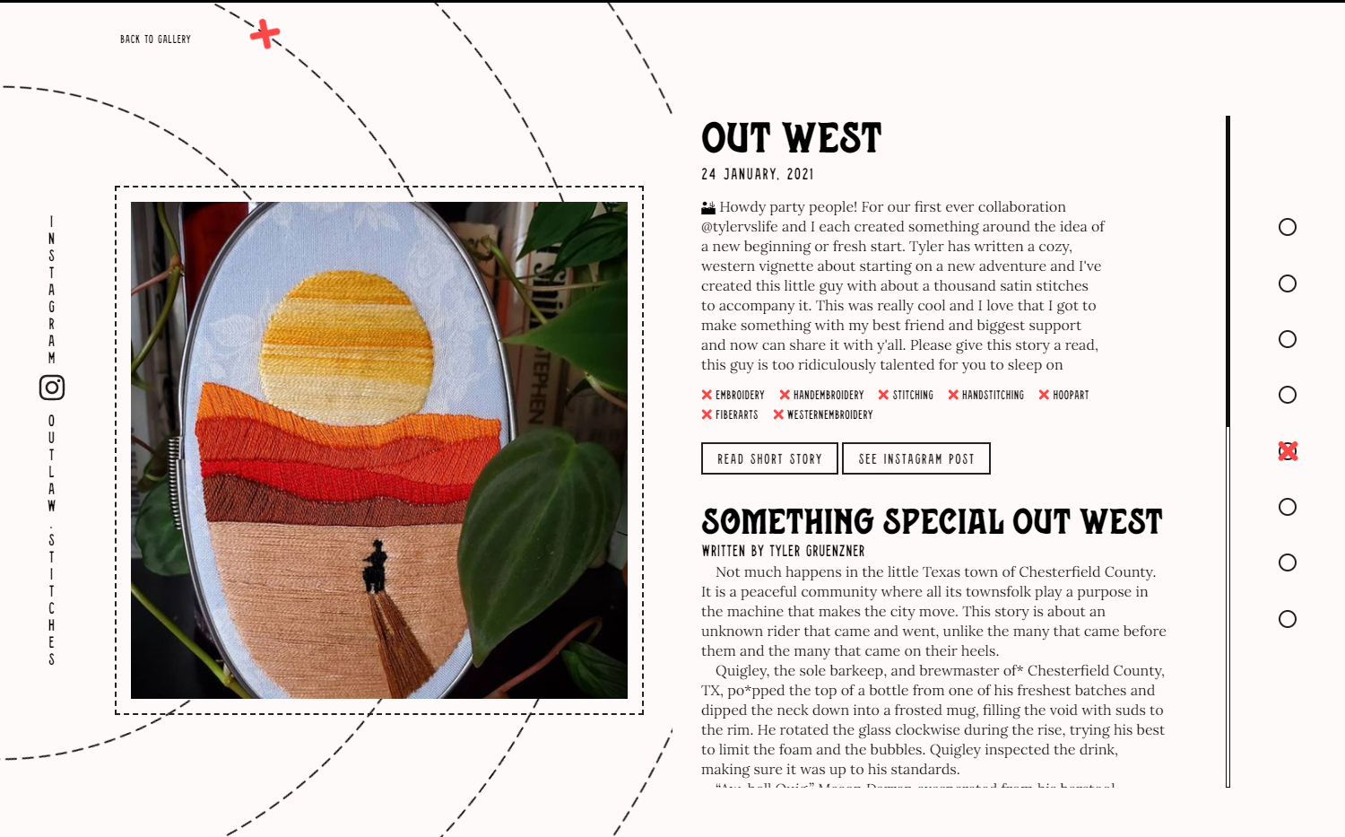
Lexie Strack is a cross stitch artist based in Houston, Texas. After creating her work under her own name for many years, she began publishing specific peices under a brand: Outlaw Stitches.
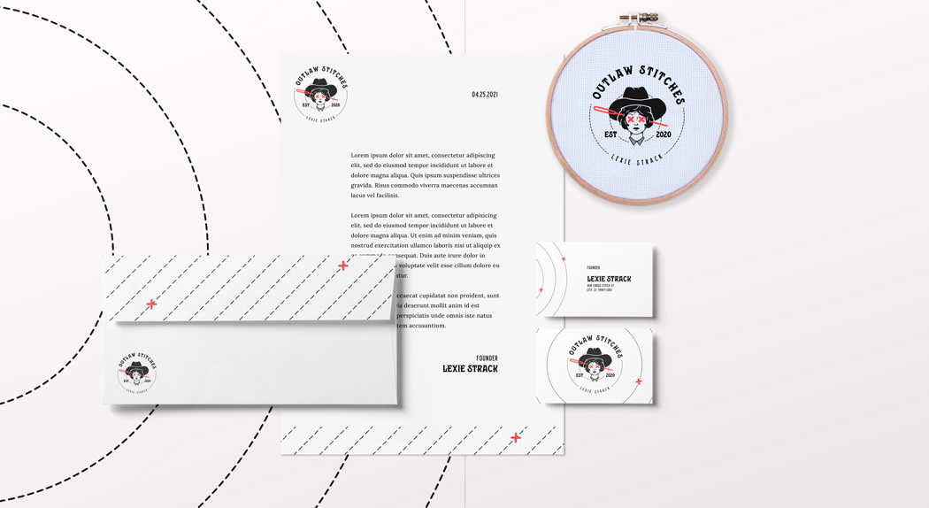
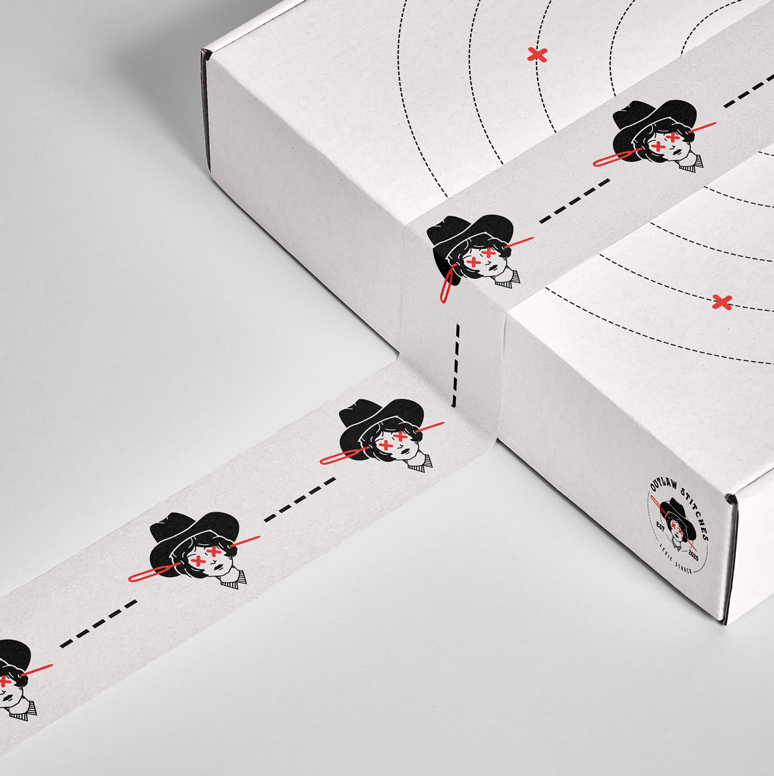
As she moves forward with this new brand, she needed a look that captured a delicate craftswoman, who's not afraid to pull punches, with a hint of southern charm.
Logo


Color
The choice for black and white was made to tie back to tattoo art, which is integrated often into the Outlaw Stithces artwork. To connect to the danger of being an outlaw, and the ???, I went with red as a statement color.
Pale#FFFAFA
Ink#111111
Blood#FC4747
Typography
Brand Application
Website Screens
Code
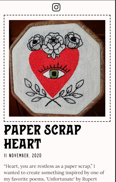
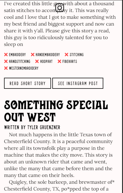
A major focus of the Outlaw Stitches website is the gallery. This is a "standard" work selector that I use for projects, including my portfolio as well:
class WORK_SELECTOR{
constructor(buttonElems, galleryElem, galleryItemWrapElem){
this._buttonElems = buttonElems;// Node List of the Buttons that trigger the Swap
this._galleryElem = galleryElem;
this._galleryItemWrapElem = galleryItemWrapElem;
this.attachEventToButtons(this._buttonElems);
}
attachEventToButtons(buttonElems){
let obj = this;
for(let i = 0; i < buttonElems.length; i++){
buttonElems[i].addEventListener("click",obj.swap.bind(obj));
}
}
swap(e){
let obj = this;
let t = e.currentTarget;
let currentButton = document.querySelector("nav.work-selector button[data-state='active']");
let currentItem = obj._galleryItemWrapElem.querySelector(".work-item[data-state='active']");
window.scrollTo(0, this._galleryElem.getBoundingClientRect().top + window.scrollY);
// FIRST LOAD
if(document.body.dataset.state !== 'work'){
document.body.dataset.state = 'work';
setTimeout(function(){
obj._galleryElem.querySelector(".gallery-button-wrap").style.display = "none";
obj._galleryItemWrapElem.style.display = "flex";
if(currentItem) currentItem.dataset.state = "";
obj._galleryItemWrapElem.querySelector(`.work-item[data-label='${t.dataset.label}']`).dataset.state = 'active';
},600);
setTimeout(function(){
obj._galleryItemWrapElem.style.opacity = 1;
},640);
} else{ // SECOND LOAD
if(currentItem) currentItem.dataset.state = "";
obj._galleryItemWrapElem.querySelector(`.work-item[data-label='${t.dataset.label}']`).dataset.state = 'active';
}
if(currentButton) currentButton.dataset.state = '';
// TODO - better way to do this...
document.querySelector(`nav.work-selector button[data-label='${t.dataset.label}']`).dataset.state = 'active';
}
}
SKILLSET
View My Résumé- Design
- UI + UX
- Illustration
- Web Design
- Branding
- Development
- HTML + CSS
- JavaScript
- React + Redux
- Java
- Github + Gitlab
- CI/CD
- Teamwork
- Kanban + Agile
- Devops
- Web Accessibility
- Programs
- Adobe Illustrator
- Adobe Photoshop
- Adobe InDesign
- Eclipse IDE
CONTACT
Looking to get in touch?
